Your homepage quality will influence your conversions, SEO rankings, and bottom line — for better or for worse. But don’t panic!
This comprehensive guide will discuss website homepage design and give you all you need to create a page that will impress your visitors and help you achieve your business goals. Let’s go!
Why is Website Homepage Design So Important?
Nail the first impression
First impressions count, especially when it comes to your online presence. For every website, the homepage is a critical page. When someone visits your site, it’s the first thing they’ll see. A solid first impression is crucial!
Establish that you’re credible and trustworthy
Your website homepage is also your opportunity to establish credibility and trust with your visitors. You can do this by including elements like customer testimonials, awards, certifications, and more. (Heck, even an encouraging text message from your parents works!)
Show what you offer
The homepage is also the perfect place to showcase what your business has to offer. This could include a list of products or services, photos or videos of your work in action, or even a ‘featured product’ section.
Whether it’s an investor, customer, enemy, or friend, they should walk away from your homepage with a solid understanding of what you do.
Guide customers to your other pages
Finally, the homepage can provide lead visitors to the next step — whether that’s subscribing to your newsletter, giving you a high-five, downloading a white paper, offering you a compliment, or making a purchase. (Three truths, two lies).
How Do I Create a Good Homepage?
Creating a good website homepage can be tricky, but it’s not impossible. Here are a few easy tips to help you create a page that will impress patrons and help you succeed.
First, you need to decide what you want your homepage to achieve:
- Is it meant to introduce your company and its products or services?
- Or is it meant to provide more in-depth information about your business?
- Are you trying to gather emails for potential leads?
Once you’ve determined your goal, you can start designing the page. It’s essential to develop your page with your visitors in mind and ensure that it is visually appealing and easy to use.
- Convey a robust and concise idea as your main header/hero message. Be sure to use a clear and easy-to-read font and use headings and subheadings to break up the text.
- You should also include a section that contains the most critical information — a lead content block that offers an overview or a pitch.
- Finally, don’t forget to include a call to action! This could be a form for visitors to fill out, a button to click, or simply a link to another page on your website.
Let’s go into more detail on these essential homepage features, plus two other must-haves:
Homepage Design Essentials You Cannot Miss
Hero message
The hero message on a webpage is the primary message you want to communicate to your visitors. You should feature your hero message prominently on your homepage, usually in the form of a headline or tagline.
Your website’s hero message should:
- Be clear and concise: You only have a few seconds to capture your visitor’s attention. Make sure that your hero message is short and to the point.
- Be attention-grabbing: Use strong language and visuals to make your hero message stand out from the rest of the content on your homepage. A clear, readable font, paired with a high contrast background, goes a long way.
- Communicate what you do: Your website visitors should know what your business does within seconds of landing on your homepage. Ensure that your hero message communicates your company’s mission, goals, or offerings.
Lead content block
A lead content block is the section of your homepage where you showcase your most important content. Make sure that the lead content block is both attention-grabbing and informative.
Some things to consider when creating a lead content block:
- What’s the most critical information that you want to communicate?
- Who is your target audience?
- What kind of tone do you want to set?
- What action do you want website visitors to take?
The lead content block should be prominently featured on your homepage and should be easy for website visitors to find. It’s often a good idea to place it near the top of the page, above the fold.
Call to action
A call to action is an instruction that encourages website visitors to take a specific action. It’s essential to include a call to action on your homepage, as it can help you achieve your business goals.
Some things to consider when creating a call to action:
- What do you want website visitors to do?
- What is the desired outcome?
- How can website visitors easily complete the desired action?
- Are there any obstacles that might prevent website visitors from completing the desired action?
The call to action should be easy to find and easy to complete. It’s usually best to place it below your hero message and above the fold. You can also include one in your navigation menu, but do this sparingly!
Contact information
Your website should allow visitors to contact you with ease. This means including precise and up-to-date contact information on your homepage.
Some things to consider when including contact information:
- What is the best way for website visitors to get in touch?
- Do you have more than one location?
- Is your contact information easy to find?
- Is your contact information up-to-date?
It’s usually best to place contact info near the bottom of the page, below the fold. You may also want to consider including a map if you have multiple locations.
Footer
The footer is the section of your website that appears at the bottom of every page. It typically includes links to important pages on your website, copyright information, and contact information.
Some things to consider when creating a footer:
- Are there any vital pages that website visitors should be able to access from the footer?
- Do you have any social media profiles that website visitors can follow?
- Is your contact information up-to-date?
The footer is an integral part of your website: it’s usually best to place it at the bottom of every page, as it will also help you with SEO internal link building.
Tips For Building A Website Homepage That Converts
Write a winning headline
Writing a good headline can be tricky, but it’s not impossible. To make an eye-catching headline, you’ll need to focus on the benefits that your product or service offers. You should also make sure that your headline is relevant to your target audience.
Here are some common frameworks for writing compelling copy (plus examples for inspiration):
Problem-Agitate-Solution:
Hero vs. Villain / Us vs. Them:
Audience-Service:
Include aesthetically pleasing visuals
Your website homepage should look stellar! Aesthetically pleasing visuals can help create a favorable impression and encourage people to stay longer on your website.
For example, slideshows and videos can be a great way to capture website visitors’ attention and introduce them to your business. They can also help you simply explain complex concepts. When creating a slideshow or video, be sure to keep it concise.
Use testimonials to show credibility
Testimonials are a great way to build trust and credibility with site visitors. If you have happy customers, showcase their testimonials on your homepage! Avoid using generic or fake testimonials — they will only hurt your business in the long run.
When choosing testimonials to feature on your website, look for ones that:
- Are real: Make sure that the testimonials are from real people who have actually used your products or services.
- Are relevant: Choose testimonials that are relevant to your business and target audience.
- Are specific: Generic testimonials are not as effective as specific ones. Look for testimonials that mention specific products, services, or features.
Send a clear and concise message
Your homepage must have a clear and concise message. This means that you should focus on one or two main goals and communicate them effectively to your visitors. Don’t try to cram too much information into a small space — it will only confuse and overwhelm your guests.
Ensure visitors have easy navigation
A well-designed website homepage should be easy to navigate. This means that your visitors should be able to find what they are looking for with ease. If they spend too much time hunting for information, they’ll quickly lose interest and move on to another website.
Optimize for multiple formats
Like the rest of your website, your homepage should be attractive and functional on mobile devices, desktops, and tablets alike. Responsive/interactive web design is your friend here!
Frequently change it up
There’s a high chance that the homepages featured in the next section will be different by the time you read this — and that’s okay! Homepages are meant to be dynamic; they should adapt to your current brand message, campaign, release, etc.
The 7 Best Homepage Design Examples We’ve Seen
To make your website’s homepage design brilliant instead of just good, we need to look at some examples.
Here are the homepage designs we’re going to look at:
- FreshBooks
- Airbnb
- Evernote
- TED
- KIND
- Basecamp
- Netflix
FreshBooks

FreshBooks gets a lot right with this homepage:
- Effective headline. Their header is a great example of the classic audience-service format: the ‘Owners’ are the audience, the service is ‘Accounting Software’. They delivered the core message in just five words.
- Repeated call-to-action. Typically, having two CTAs on your homepage isn’t a great idea — but FreshBooks repeats the ‘Buy Now & Save’ prompt twice so you know it’s the ideal action.
Airbnb

Whenever anybody discusses homepage designs, Airbnb inevitably comes up. Here’s why:
- The core offering is front and center. Airbnb helps you find places to stay when you’re traveling, so they place their search bar above the fold where you cannot miss it.
- Unconventional header and CTA. Your copy should address your readers’ concerns and validate them — Airbnb does that with this headline. The CTA is in first-person, making the page more personable.
Evernote

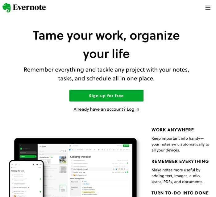
Evernote joins Airbnb in the upper echelons of fantastic homepage designs. It’s changed several times over the years, but some things persist:
- They have balanced messaging. Their header is compelling and straightforward, while their lead content block describes a few key benefits. Evernote provides a suite of productivity tools beyond just note-taking, so it’s crucial they can communicate all of their advantages.
- The right visuals. There are a lot of note-taking apps out there — by using mockups of their UI, Evernote can differentiate itself right off the bat. If the homepage leads to an app download, this is an especially great idea!
TED

The TED website curates its massive library of content, so the homepage has lots of potential for the organization:
- Uses the homepage to its fullest. TED Membership is the organization’s contribution system to collect funds in exchange for live events, Q&As, and more. This is clearly a vital business goal since it features so prominently — if you’re focusing on a major campaign, shill it front and center!
- The leading block is recent content. You’ve probably watched one TED talk, which led to another, and another, all the way down an internet rabbit hole that ends at 3 AM. TED knows this, so they start you off with recent content right away. Then, just follow the white rabbit…
KIND

KIND bars are popular health snacks that you can order as a subscription service. They also offer some excellent website design inspiration:
- Strong visuals. Firstly, KIND bars have great packaging — showing them off in the hero visuals is an attractive choice. Secondly, the image shows you what you can expect if you subscribe, assuaging any uncertainties a site visitor may have.
- Interactive web design. You don’t need to develop a new-gen digital experience to make your homepage interactive. A slider — like KIND’s — is really all you need.
Basecamp

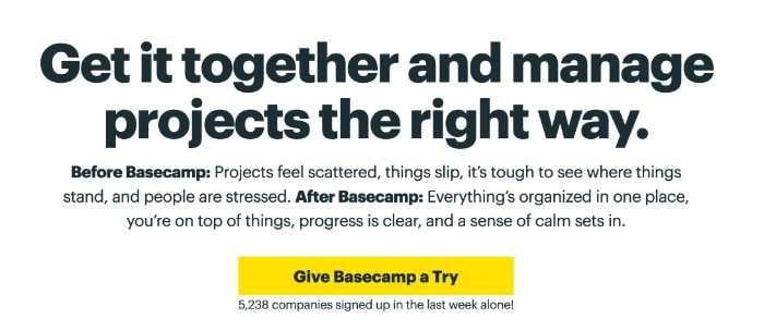
Basecamp is a fascinating example of how to keep your homepage dynamic and relevant. Notice how that first header emphasizes remote work? It’s from February of 2022. Now, look at the same web page but in January of 2020:

No mention of remote work at all.
- Keep your homepage relevant. As remote work became an increasingly important topic, Basecamp must have realized that A) their product is great for remote teams and B) they could capture growing search volume around remote work.
- Casual call-to-action. Most B2B project management software is very professional and robotic in its language. Basecamp takes a different approach with a non-committal “Give Basecamp a Try”. The number of companies below is also great social proof!
Netflix

Netflix’s starting page is understated and simple — but that doesn’t mean it’s not a brilliant homepage design:
- Say no more than necessary. Netflix’s NPS (net promoter score) is off the charts. You probably knew about Netflix long before you bought it. So, when you get to the homepage, you want minimum friction when signing up. Netflix knows they don’t have to try too hard to sell you on their service, so they limit copy and simplify the CTA.
- Understated visuals can be just as compelling. The background image is a series of shows and Netflix originals you’ve probably heard of before. It’s constantly updated with new shows and movies, so you can always get a peek at the latest content. (We all have to catch up on Ozark!)
Perfect Your Website's Homepage Design Today
Your homepage will be easy to use and visually appealing if you follow these simple tips. Experiment with different layouts and design elements until you find a combination that works for your business. And don’t forget to include a clear headline, an engaging slideshow or video, and easy-to-find contact information.
By implementing these elements, you will be able to wow visitors and accomplish your goals with no issues.
Frequently Asked Questions (FAQs)
How do I create a homepage for my website?
There is no one-size-fits-all answer to this question. You should experiment with different layouts and designs until you come up with the right fit for your brand. Remember to have a descriptive headline, engaging content, and accessible contact information.
What are some common website homepage design mistakes?
Some common design mistakes include:
- Cramming too much information into a small space
- Failing to include a clear headline
- Making it difficult for visitors to navigate the site
How can I improve my website’s homepage design?
If you’re not happy with your website’s current homepage design, there are a few things you can do to improve it.
- First, take a look at the overall layout and see if you can change anything to make it more user-friendly.
- Second, try to rephrase your header in as few words as possible.
- Finally, optimize your visuals so they all convey the same message.
Whether it’s a custom wedding website, SaaS product, or government database, these tips will help regardless!
How long should my website’s homepage be?
There is no definitive answer, but longer is generally better. Aim for anywhere between 1,500 and 2,000 words. Supplement this with rich testimonials, images, video, and other interactive content.
What should be on the homepage of a website 2022?
Some essentials include:
- Hero message/headline
- Lead content
- CTA
- Contact info
- Footer
On top of that, ensure you offer easy navigation, aesthetically pleasing visuals, and testimonials.

