Clearly, lead generation is an essential part of business. The number one strategy behind it? Creating effective landing pages.
But what is a landing page exactly? And more importantly, how can you make sure that your landing pages convert more than they bounce?
This blog post will answer these questions and provide some tips on creating high-conversion landing pages. Ready? Let’s go!
What Is a Landing Page?
A landing page is a standalone web page on your website designed to drive visitors towards a specific action. For example, you might use a landing page to promote an upcoming event or collect email addresses for future marketing campaigns.
A good landing page will be relevant, easy to find, and well-written with compelling visuals that immediately capture the reader’s attention.
A typical landing page has three main components:
The headline – this is what people see first when they land on your site (e.g., “Sign up to get 30% off your first order!”). The goal here is usually to get someone’s attention. It should be short but catchy enough for them to read what comes next.
The body copy – this is where you’ll put all of your content. Use brief paragraphs broken up by images, video clips, and other visuals that appeal directly to your visitor’s questions about your offer.
The call-to-action button (CTA) – what does your visitor need to do next? Is it signing up for an event or subscribing via email so they can receive updates? Whatever the goal may be, make sure there’s no confusion about what action should be taken once a prospect lands here.
Different Types of Landing Pages
There are many different types of landing pages. Overall, they fit into two categories:
- Lead generation landing pages
- Conversion landing pages
We’ll cover some examples of both:
Squeeze Page
In 2022, 78% of marketers see growing engagement with email campaigns. Bottom line: email is an unfairly powerful channel.
A squeeze page is a landing page used to collect email addresses. The goal is to get people to sign up for your mailing list by giving away something of value, such as an ebook, white paper, or first-born child.
Lead Capture Page
A lead capture page is very similar to a squeeze page, but it collects information about potential customers rather than email addresses.
It usually includes a form where visitors can enter their contact info in exchange for some sort of incentive, such as a discount coupon, access to exclusive content, or just a really solid high-five.
Remember, the average bounce rate for a website is around 50%. So, if you’re asking visitors for more info than usual, your offer needs to be very compelling.
Paid Search Landing Page
The average ROI for a Google Search Ad is 200% — if you want to take advantage of those search engine results pages, you’ll need a landing page.
A paid search landing page is designed specifically for people who have clicked on one of your ads on social media or search engines. The goal is to convince them to either buy what you’re selling or sign up for more information about what you have to offer. Think Twitter bio, but a million times more powerful.
Click-through Landing Page
A click-through landing page is used when the visitor has already decided that what you’re offering sounds exciting and wants to learn more before making any purchases.
The goal here is not necessarily conversion but rather engagement. After all, the average CTR for CTA buttons is around 5%. Pages like this typically need testimonials to really put a ring on the visitor.
Long-form Sales Landing Page
A long-form sales landing page is a more detailed version of your standard product landing page. It’s designed to persuade people who are already interested in what you’re selling to make a purchase.
On average, people spend just under a minute on web pages. That’s why this type of landing page usually includes lots of images, videos, and testimonials to help seal the deal.
Which Kind of Landing Page Should You Use?
The right type of landing page depends on what you’re trying to achieve in your marketing campaign. If you’re looking for email subscribers, a squeeze page or lead capture page might be the best option. If you want people to buy what you’re selling, a paid search landing page or click-through landing page would be more appropriate.
Why Should You Use Landing Pages?
Like memes, landing pages are an essential part of any marketing strategy. They’re a great way to increase your website’s conversion rate by focusing on specific goals. That lets you provide the right content and call-to-action for each campaign.
Landing pages also help you track the results of your marketing efforts so you can see what’s working and what needs improvement. And since they’re easy to create and relatively inexpensive to produce, there’s no reason not to use them!
Benefits of Using a Landing Page
Landing pages have several benefits, including:
Increased conversions. It’s easier to convert visitors when they’re on a page that’s been designed specifically for what you want them to do. This means there won’t be any distractions like navigation bars or sidebars with links to other pages competing with your primary goal!
Improved SEO ranking. Landing pages provide an opportunity to target specific keywords and phrases that you wouldn’t normally rank for on your website’s homepage. And since Google likes websites that are regularly updated with fresh content, using landing pages is a great way to give your SEO efforts a little boost.
Easier tracking and analysis. Landing pages make it easy to track the results of your marketing campaign so you can assess and iterate on your creative. You can then use this information to create future campaigns that are even more successful!
Quick and easy creation. Creating a landing page typically takes less time than creating an entire website from scratch — plus, there are plenty of online templates if you feel like copying someone’s homework (no shame, we’ve all done it).
How to Make a Killer Landing Page
The time has finally come to build your own landing page. But how do you go about this? Here are some landing page best practices to follow:
Keep it simple. The most successful landing pages are clean and uncluttered with just enough copy to get your point across — without overwhelming visitors (or Google). You should also include an easy-to-read CTA button throughout the page, so people know what action they’re supposed to take next!
Make sure you have a clear goal in mind. And not a New Year’s Resolution — something that will stick. Make sure that your goal for this campaign is not only achievable but measurable too. And remember: keep it specific! A generic goal like “I want more money” is relatable — but it won’t cut it here.
Use images and videos. People are visual creatures, so using eye-catching photos and videos is a great way to reel them in. Plus, it helps break up the text and makes your page more interesting to read.
Include testimonials. Social proof is a powerful tool, especially on landing pages. Including quotes or endorsements from happy customers can help convince others that they should buy what you’re selling too!
Make it easy to share. If people like what they see on your landing page, chances are they’ll want to share it with their friends on social media sites like Facebook or Twitter. So make sure you include buttons or links for easy sharing!
Test, test, test! The only way to know what works best for your company is by testing different versions of the same landing page and seeing what gets better results.
Landing Page Examples to Learn From
Airbnb


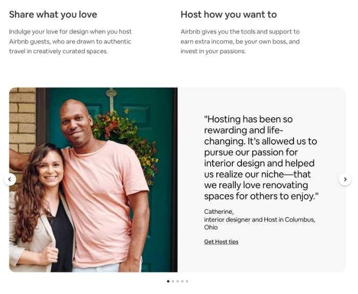
This Airbnb landing page has conversion as its center. It’s designed for people curious about hosting on the platform, and it does several things right:
- Clear call-to-action
- User testimonials
- Information resources
Row House

This lead generation landing page from Row House hits the mark perfectly. While the bottom half of this landing page isn’t anything extraordinary — it doesn’t have to be.
- Header copy is clear and memorable
- Body copy is concise and informative
- Video background is attention-grabbing
Sunbasket

This lead generation page from Sunbasket follows a classic formula. Tease a compelling offer ($90 + 1 free gift), then hide it behind a form. Here’s what’s great about this landing page:
- Bright colours and imagery
- All the information is available front and center
- One of the CTAs is ‘Claim Your Free Gift’ — by making your visitor feel ownership, you can boost conversions.
Start Creating Landing Pages That Convert Today!
Now that you know what goes into an excellent landing page, it’s time to get started! The best way to learn is by example, so be sure to check out some of the best landing pages out there and see what makes them work. And don’t forget: always test multiple landing pages to see what gets the best results.
Still curious about landing page optimization, web design, and beyond?
Frequently Asked Questions (FAQs)
What is the purpose of a landing page?
Generally, landing pages work toward some kind of conversion. While it typically depends on where someone is in the marketing funnel, that conversion is usually from impression to lead (a lead-gen page) or lead to customer (a sales page).
How long should my landing page be?
There’s no set answer, but it’s essential to keep your copy concise and easy-to-read, so people don’t get overwhelmed or distracted. Generally, shorter web pages are easier to read — but harder to rank (for SEO). Finding a balance is critical.
What’s the difference between a landing page and a website?
A landing page is typically a single web page designed as part of your marketing campaign. On the other hand, websites are what you use to host all of your content (blog posts, product pages, etc.).
What does a landing page consist of?
A landing page usually has a headline, a subheadline, introductory text, and a form. It may also include images or videos and testimonials from happy customers.

